Creating a Range Slider for a React Native app
 By Akash Patel
·
📅 Published: February 28, 2023
·
🔄 Updated: February 23, 2025
·
⏱ 6 min read
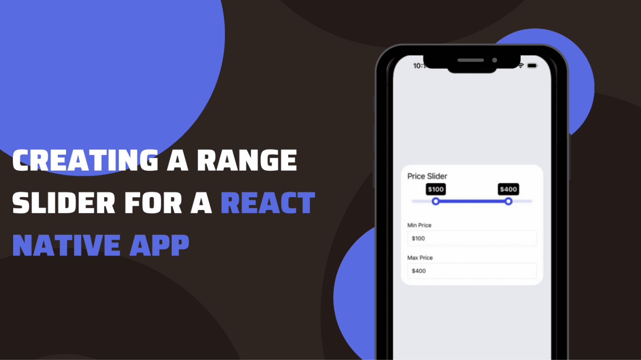
Getting a slider interface for a specific range is easier with React Native app. Only you need to get an appropriate third-party plugin and frame the codebase. Let’s see the entire process in detail in this blog.
However, first, we need to get some theoretical understanding of the concept and the project setup.
Define a Range slider
You can consider it as an element. You can add a range slider in your app to get a customised range value. Thus, it will allow users to move the slider and set a specific range based on their preference. With moveable and clickable pointers, a range slider is used for shopping apps where users can set a specific price range and search for their products under their budget. You just need to add the minimum and maximum range in the codebase. We will see later in the coding part, how you can set the maximum and minimum range values.
With React Native framework and its support for the third-party plugin, you can customise the pointers and design a responsive layout for this element. Let’s see what are the common practice that developers of react native app development company perform before starting to code.
What are the prior-needed contexts?
There are two contexts that you have to be familiar with beforehand. These are as follows.
- Environment setup for React Native– The steps of setup are about selecting the right tools and software and also the process of installing that software. Visit the linked reference article to get a detailed understanding of the steps of Environment setup for React Native framework.
- Basic template for the project– Here, you have built a React Native file in your C drive in the system. For this follow the below-given steps.
- Choose an empty folder in the C drive. If you don’t have one, create one.
- Open the command prompt from the folder and pass npx react-native init RangeSlider –version 0.68.1. The name of the file or project template is given as RangeSlider. Here, we are using the React Native version 0.68.1. This will create the template that you want to build.
Installing a multi-slider for the project
The third-party library support provided by the React Native framework is the most useful feature. You, as a developer, don’t need to create components that are not available in the core library from scratch. They can take help from the open- community and get plugins that are specifically for a definite project.
Here, it is @ptomasroos/react-native-multi-slider.
You can get the Multisdier component from this plugin. For its installation, you have to execute the command npm i @ptomasroos/react-native-multi-slide in your app terminal.
Now we will start with the codebase.
Read Also: Top Mobile App Development Trends to Watch Out for in 2023
Designing the codebase in the App.js file
Note that you don’t have to create this file. You will find this .js file already stored in your template folder RangeSlider.

Here, we have to get the core component from the react-native library.
useState also imports to set the state of the chosen variable.
The most important component MultiSlider is imported from the @ptomasroos/react-native-multi-slider. It is used to design the range slider element for the current app.

This is a function that returns the value of the slider. It takes in two values and sets them to 0 and 37. The first value is the minimum value of the slider, while the second one is its maximum value.
multiSliderValuesChange is a function introduced in this code syntax. It has values as its parameters. setValue is used to update any change in the parameter values when any argument is passed into multiSliderValuesChange.

The syntax shown in snippet 3 returns View and Text components. Some styling elements are added to all the components. It will be defined later in the codebase. The Text component is used for a text element ‘slider’. The View component is used to render a container and the slider_box.
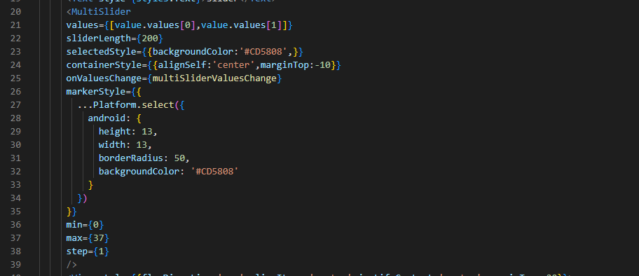
In the code syntax mentioned in image 4, values of MultiSlider are added.
With the syntax, [value.values[0],value.values[1]], the code creates an array including two elements. It has a values property for the value object.
The property value is at index 0 and the second element in this array is at index 1.
The sliderLength is set as 200 pixels. The backgroundColor of the selectedStyle is set as ‘#CD5808’. The container is aligned at the center and it has a margin at the top, which is set as -10 pixels.
onValueschange is a prop or you can say it is an event handler. It is linked with the action when the user slides through the range slider and changes its value.
Different styling parameters are added to the markerStyle. It is rendered on the Android platform. The width and height of the marker are set to 13 pixels. It has a specific border radius and background color.
The range slider includes all numbers from 0 to 37, counting by 1 each time.

Styling elements of the main container, ‘-’, ‘min’, and ‘max’ are defined in this code syntax.
A specific color, fontSize, and top margin are mentioned in the code syntax.
Don’t forget to export the App component in the last.
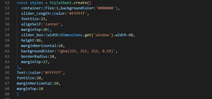
This is about creating StyleSheet objects. It has the container, slider_box, slider_Length, and Text. The Dimension method is used for the slider_box. This is for the project’s responsiveness.
You can change the color, border radius, font size, and other styling parameters as per your preferences.
As we have completed the codebase, we will move toward executing the created program.
To run the program on the Virtual Device
For this, you have to consider two commands. First, open the cmd from your app or project. Then run npm install and npx react-native run-android simultaneously.
Note that every time you have to pass any command for your project, you have to open the cmd from your project.
For the Slider project I have built, consider image 7 as its output.
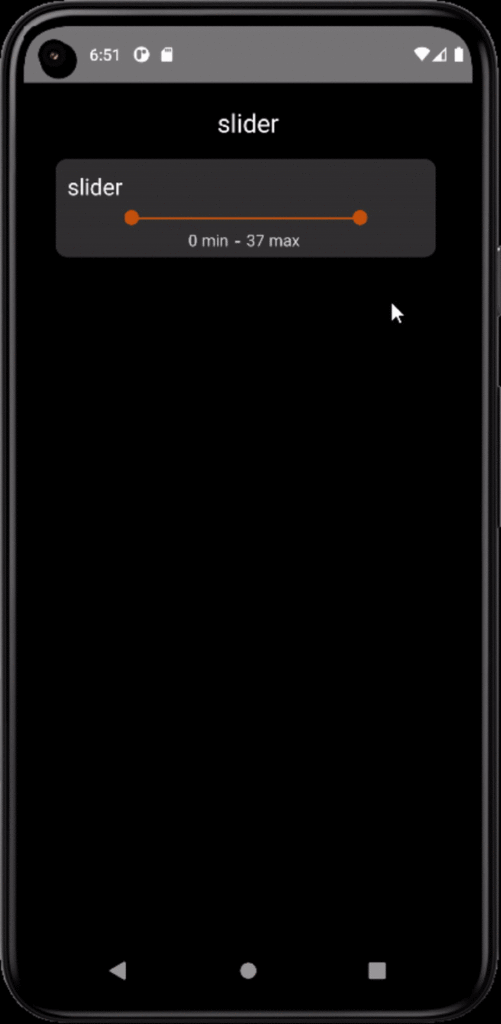
Hope you have enjoyed building the range slider project. Happy coding!!!
Ready to Get Started?
Your Details will be Kept confidential. Required fields are marked *


