HubSpot Landing Page Design: 11 Tweaks That Dramatically Increase Leads
 By Rahul Solanki
·
📅 Published: March 12, 2026
·
🔄 Updated: March 26, 2026
·
⏱ 15 min read
By Rahul Solanki
·
📅 Published: March 12, 2026
·
🔄 Updated: March 26, 2026
·
⏱ 15 min read
Most HubSpot landing page design conversations start in the wrong place. Teams debate color palettes, hero image choices, and section layouts while the actual conversion problems sit in places that are far less obvious and far more fixable.
The gap between a landing page converting at 3% and one converting at 12% is rarely a dramatic redesign. It is almost always a collection of specific, incremental decisions made at the design and copy level that compound into a meaningful difference in lead volume. The challenge is knowing which decisions actually move the needle and which are cosmetic choices that feel meaningful but do not change visitor behavior.
This guide covers 11 specific HubSpot landing page design tweaks that have a documented impact on conversion rates. Each one addresses a real mechanism in how visitors process and respond to landing page content, not a subjective preference for how pages should look. If your current landing pages are generating traffic but underperforming on lead capture, working through this list systematically is the most direct path to improvement.
Quick Answer: What HubSpot Landing Page Design Changes Actually Increase Leads?
What are the most impactful HubSpot landing page design tweaks for increasing lead conversion rates?
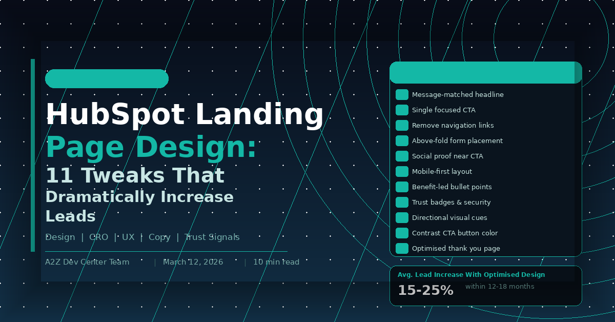
The highest-impact HubSpot landing page design changes are those that reduce cognitive load and clarify the conversion path. Specifically: matching the page headline to the exact promise in the traffic source, removing navigation links, placing the form above the fold on high-intent pages, and positioning social proof directly adjacent to the CTA. Businesses that apply these four changes systematically see 15 to 25% improvements in lead conversion rates within 12 to 18 months of consistent optimization across their landing page portfolio.
Key Takeaways
- Message match between traffic source and landing page headline is the single highest-leverage design decision available, yet it is skipped in the majority of HubSpot landing page builds
- Removing navigation is a 10-minute change that consistently produces measurable conversion rate improvements and requires no design skill to implement
- Social proof placed directly adjacent to the CTA converts better than social proof placed in a separate section because it reduces decision friction at the moment of commitment
- Mobile-first design in HubSpot is not just about responsive layout. It requires rethinking form field sizing, CTA button placement, and content hierarchy for small screens specifically
- Visual hierarchy and whitespace decisions affect how long visitors engage with page content before bouncing, which directly impacts conversion probability
- Thank you page optimization is the most overlooked lead generation opportunity in most HubSpot implementations and requires almost no additional traffic to produce results
Tweak 1: Match Your Headline to the Traffic Source
The first thing every visitor evaluates when landing on a page is whether they are in the right place. That evaluation happens in under three seconds and is based almost entirely on whether the headline reflects what they were promised before they clicked.
A visitor who clicked a Google ad for “HubSpot CRM setup for small business” and lands on a page headlined “Grow Your Business With Our Solutions” experiences an immediate disconnect. The brain registers a mismatch, trust drops, and the probability of staying on the page decreases sharply before the visitor has read anything else.
Fixing this in HubSpot is straightforward. For paid traffic, create a unique landing page variant for each ad group where the headline contains the same core phrase the ad targeted. For email traffic, mirror the subject line or primary CTA text from the email in the landing page headline. For organic search traffic, confirm that the page title tag and H1 contain the exact primary keyword the page ranks for, because visitors from organic search are making the same relevance judgment.
HubSpot’s URL parameter and smart content features allow dynamic headline personalization across traffic sources without multiplying your page count. The how to build HubSpot landing pages that actually convert guide covers the technical setup for smart content personalization in detail.
Tweak 2: Remove Navigation Links
This is the most underimplemented change in HubSpot landing page design and one of the most consistently impactful. Navigation links create exit paths that require zero decision-making effort from the visitor. Every link in your header is a door out of the conversion funnel that requires no commitment to use.
HubSpot landing page templates can be configured to hide the global navigation header entirely. This is a setting, not a rebuild. It takes minutes to change. Yet the majority of landing pages built on HubSpot still include full site navigation, footer links, and social media icons, each of which competes with the single action the page was built to drive.
The same principle applies to footer links, sidebar menus on any page using a sidebar layout, and social media icon rows. Every link that does not lead to the form confirmation or the CTA represents a conversion leak. Pages built without any exit links except the form submission consistently outperform pages with navigation on conversion rate tests, often by significant margins.
Tweak 3: Place the Form Above the Fold on High-Intent Pages
Above-the-fold form placement is not universally correct. It depends on where the visitor is in the buying journey when they arrive on the page. But for high-intent traffic, visitors arriving from a bottom-of-funnel keyword or a direct campaign targeting warm leads, placing the form immediately visible without scrolling is almost always the right call.
The logic is simple. A visitor who arrives on a page already decided to convert should not have to scroll to find the mechanism to do so. Every additional scroll required before reaching the form is an opportunity to lose them to distraction or second-guessing.
In HubSpot’s drag-and-drop page editor, form modules can be placed in a two-column layout in the hero section, with the headline and value proposition in the left column and the form in the right. This layout has been tested extensively across B2B landing pages and consistently performs at or near the top of layout tests for commercial intent traffic. The HubSpot CRM and lead generation strategy guide covers how above-the-fold form submissions connect to workflow triggers and CRM property population.
Tweak 4: Use Benefit-Led Bullet Points, Not Feature Lists
The copy below your headline is where most landing pages lose the visitor’s attention. The most common mistake is listing features instead of benefits. Features describe what something does. Benefits describe what the visitor gets or avoids as a result.
“Includes 12 pre-built workflow templates” is a feature. “Set up your first automated follow-up sequence in under an hour” is a benefit. Both convey similar information but the second speaks to the visitor’s actual concern, their time, their effort, and their outcome.
In HubSpot landing page design, bullet point sections are among the most read elements on the page because scanners hit them early in the F-pattern reading behavior that eye-tracking research consistently shows on web pages. Using that prime reading real estate for benefit statements rather than feature lists directly affects how many visitors reach the form with a strong enough motivation to convert. The 7 custom HubSpot features that transformed our clients marketing post shows how benefit framing applies not just to landing pages but across the full HubSpot content ecosystem.
Tweak 5: Place Social Proof Directly Adjacent to the CTA
Social proof works. Testimonials, client logos, review counts, and case study results all reduce the perceived risk of taking the next step. But the placement of social proof matters as much as its presence.
Social proof placed in a dedicated section three scrolls below the fold helps visitors who are already engaged. Social proof placed immediately adjacent to the CTA, directly above, below, or beside the form submit button, reduces decision friction at the exact moment the visitor is deciding whether to convert.
In HubSpot’s page editor, a one-line testimonial with a name and company title, or a row of three to four recognizable client logos, can be added as a narrow module immediately above the form submit button. Star ratings from Google or G2 work particularly well in this position because they deliver a trust signal with minimal visual weight. The why you should hire HubSpot dedicated developers post covers how portal-level trust signals connect to landing page conversion performance in client implementations.
Tweak 6: Design for Mobile First, Not Mobile Compatible
There is a meaningful difference between a landing page that works on mobile and one that was designed for mobile. Responsive layout means the page does not break on a small screen. Mobile-first design means the hierarchy, spacing, CTA size, and form layout were built around the mobile experience and then adapted for desktop.
The practical differences show up in three areas. CTA buttons need to be large enough to tap comfortably with a thumb, which means a minimum height of 44 pixels and full-width layout on small screens. Form fields need to trigger the correct keyboard type on mobile, with email fields opening the email keyboard and phone fields opening the numeric keyboard, which requires correct HubSpot form field type settings. And the page load experience on mobile needs to prioritize above-the-fold content, meaning hero images should be sized and compressed specifically for mobile viewports rather than scaled down from desktop versions.
HubSpot’s page editor has a mobile preview mode that shows the mobile layout as you build. Using it actively during design rather than as a final check prevents the most common mobile UX problems before they reach live traffic.
Tweak 7: Use Directional Visual Cues
Human attention follows implied direction. An image of a person looking toward the form, an arrow pointing at the CTA button, or a layout that creates diagonal visual movement toward the conversion element all leverage the brain’s tendency to follow directional signals.
In HubSpot landing page design this shows up in specific decisions. Hero images featuring people should have the subject facing toward the page content and form, not away from it. Arrow elements, whether actual icons or implied by layout shapes, should point toward the primary CTA. Page sections should create a visual flow that leads the eye downward and to the right, toward the conversion action.
These are not dramatic changes. They are frequently invisible to conscious awareness while consistently influencing where attention lands. Small directional adjustments in existing HubSpot pages can produce measurable improvements in form engagement metrics without any copy or offer changes.
Tweak 8: Make Your CTA Button Color Work Harder
CTA button color is one of the most tested elements in conversion rate optimization and one of the most misunderstood. The color that converts best is not a specific hue. It is the color that creates the strongest contrast against the surrounding page elements.
An orange button on a white background converts well because orange is high-contrast against white. The same orange button on a dark orange background converts poorly for the same reason. The principle is contrast, not color preference.
In HubSpot’s design manager, button colors are set at the module level and can be overridden per page. For landing pages specifically, the CTA button color should be tested against the background color of the section it sits in rather than matched to brand palette defaults. Many HubSpot landing pages use the brand primary color for buttons regardless of the section background, producing low-contrast situations that reduce button visibility and click rates. The dedicated HubSpot developer vs agency piece covers how systematic design system management in HubSpot prevents inconsistent button styling across a large page portfolio.
Tweak 9: Reduce Form Fields to Match Offer Value
Form field count is a direct proxy for perceived friction. Every additional field a visitor must complete before submitting represents a small additional cost they weigh against the value of the offer. When the cost exceeds the perceived value, the visitor abandons the form.
The correct number of form fields is not a universal standard. It is the minimum number required to qualify the lead for the next step in your sales process, calibrated against the value the visitor perceives in the offer. For a checklist download, one or two fields. For a free consultation with a defined scope, four to five fields is reasonable. For a high-investment custom assessment, six fields can be justified if the offer value is clearly communicated.
HubSpot’s progressive profiling reduces this tension by showing returning contacts only the fields that fill gaps in their existing CRM record. A contact who has already provided their name, email, and company will see company size, job title, and phone number on their next form interaction rather than being asked for information you already have. This approach consistently improves repeat conversion rates from email nurture sequences, where the same contacts encounter multiple landing pages over time. The HubSpot development guide for scaling your tech stack covers progressive profiling configuration as part of a broader portal architecture for high-volume lead generation programs.
Tweak 10: Use Whitespace Deliberately
Whitespace, the empty space between page elements, is not wasted space. It is an active design decision that controls visual hierarchy, directs attention, and affects how quickly visitors can process the page content.
Pages with insufficient whitespace feel crowded and create cognitive load that exhausts visitor attention before they reach the CTA. Pages with well-managed whitespace guide the eye naturally from one element to the next, making the conversion path feel effortless rather than demanding.
In HubSpot’s page editor, section padding and module spacing can be adjusted at the module level and in the global design manager. Common whitespace mistakes in HubSpot landing page design include insufficient padding between the hero section and the first content section, text blocks with line heights set too tight for comfortable reading, and form modules that sit flush against surrounding content rather than having visual breathing room. Each of these is a settings change rather than a redesign.
Tweak 11: Build a Thank You Page That Continues the Journey
The thank you page is the highest-intent moment in the entire conversion pathway. The visitor just took an action. They are engaged, attentive, and more open to a next step than they will be at any other point in their relationship with your brand.
Most HubSpot thank you pages say some version of “Thank you, we will be in touch.” This is a significant missed opportunity. A well-designed thank you page confirms the action, sets expectations for next steps, offers a logically related piece of additional value, and includes a secondary CTA for visitors ready to move faster than your standard nurture sequence.
HubSpot’s thank you page settings are accessible in the form editor and can be configured to redirect to a custom URL rather than the default inline confirmation. Building a dedicated thank you page as a full HubSpot page, rather than using the inline confirmation message, allows full design control and the ability to include video, case studies, calendar booking widgets, and personalization tokens that address the visitor by name. The custom HubSpot CMS development guide covers how custom page modules extend thank you page functionality for teams with more complex post-conversion journey requirements.
HubSpot Landing Page Design: Tweak Priority Matrix
| Tweak | Effort to Implement | Typical Impact | Priority |
|---|---|---|---|
| Message-matched headline | Low | Very High | Do first |
| Remove navigation | Very Low | High | Do first |
| Above-fold form on high-intent pages | Low | High | Do first |
| Social proof adjacent to CTA | Low | High | Do early |
| Benefit-led bullet points | Medium | High | Do early |
| CTA button contrast | Very Low | Medium-High | Do early |
| Reduce form fields | Low | Medium-High | Do early |
| Mobile-first layout | Medium | High | Do early |
| Directional visual cues | Low | Medium | Do next |
| Whitespace optimization | Low | Medium | Do next |
| Thank you page rebuild | Medium | High | Do next |
Frequently Asked Questions


Ready to Get Started?
Your Details will be Kept confidential. Required fields are marked *