What Makes a Conversion Focused Landing Page Successful in 2026?
 By Akash Patel
·
📅 Published: March 23, 2026
·
⏱ 14 min read
By Akash Patel
·
📅 Published: March 23, 2026
·
⏱ 14 min read
Two landing pages can have identical offers, identical traffic sources, and similar visual designs, and one will convert at 3% while the other converts at 13%. The difference is almost never one dramatic element. It is a series of specific decisions, made at the copy, design, and architecture level, that compound into a conversion rate gap that is difficult to close without understanding what is actually driving it.
A conversion focused landing page is not defined by how it looks. It is defined by how effectively it moves a specific visitor, arriving from a specific source, with a specific problem, toward a specific action. Every element on the page either supports that movement or creates friction that works against it.
This guide breaks down what actually makes conversion focused landing pages work, from the structural decisions that affect every visitor to the specific optimization levers that produce measurable improvement without a full redesign.
Quick Answer: What Is a Conversion Focused Landing Page?
What defines a conversion focused landing page and what results should it deliver?
A conversion focused landing page is a page built around a single conversion action, structured to minimize friction and maximize the relevance and credibility of the offer for the specific visitor arriving on it. Unlike general website pages that serve multiple purposes, a conversion focused landing page removes competing navigation options, aligns its headline precisely to the traffic source, and places its form or CTA in a position that matches where the visitor’s attention and intent peak. Properly built conversion focused landing pages deliver 15 to 25% higher lead generation rates than general-purpose pages used for the same campaigns within 12 to 18 months of consistent optimization.
Key Takeaways
- A conversion focused landing page has one job and one CTA. Every element either supports the conversion action or should be removed
- The headline is the highest-leverage copy element on the page. It determines whether the visitor stays or leaves before reading anything else
- Friction exists in two forms on landing pages: visible friction such as long forms, and invisible friction such as vague value propositions and weak social proof
- Page load speed is a conversion variable, not just a technical metric. Every additional second of load time reduces conversion probability
- Trust signals are not decoration. They are functional conversion elements that reduce the perceived risk of taking the next step
- The best conversion focused landing pages are built through testing, not intuition. Initial design decisions should be treated as hypotheses to validate rather than conclusions
The Single-Focus Principle
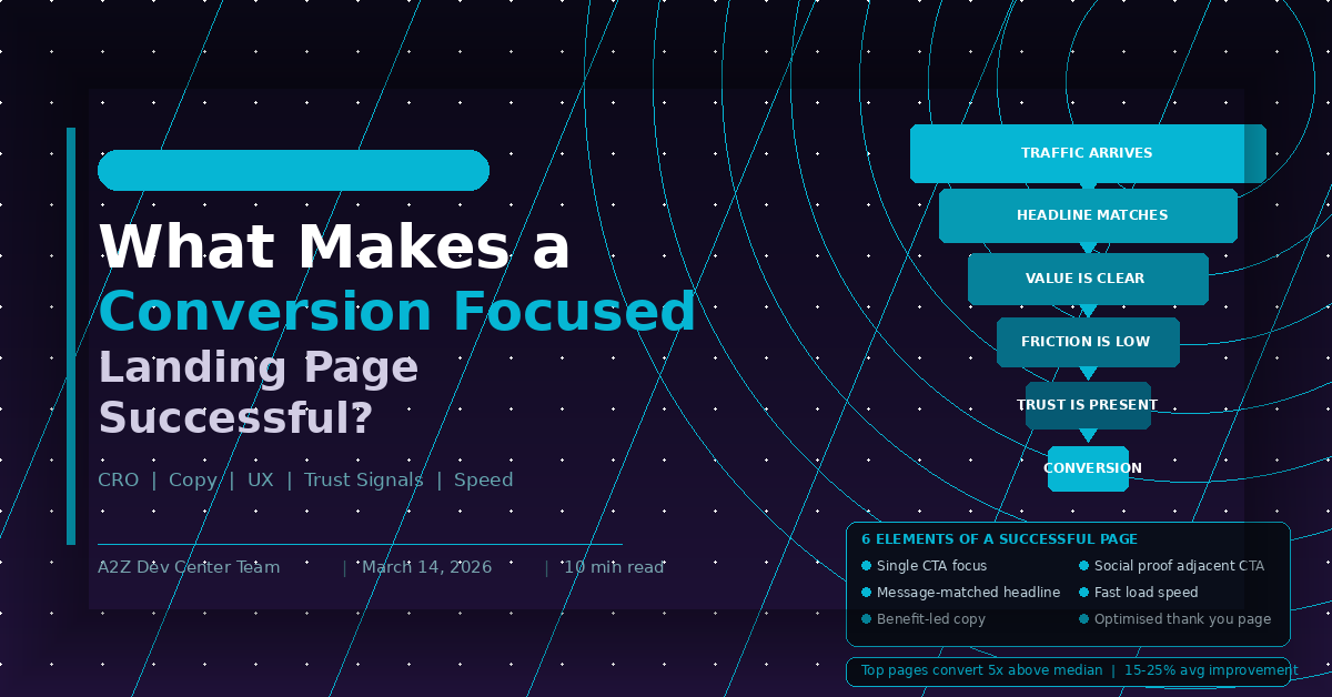
The most fundamental characteristic of a conversion focused landing page is singularity of purpose. One offer. One CTA. One conversion action.
This principle is violated constantly. Marketing teams add navigation headers because they want visitors to explore the site. They add multiple CTA buttons promoting different offers because they do not want to miss any interest signal. They add social media follow buttons, related blog post links, and footer menus because removing them feels like losing something.
Every additional action option on a landing page reduces the probability that the visitor takes the one action the page was built for. This is not a theory. It is a consistently measured phenomenon across thousands of A/B tests. The version with one CTA almost always outperforms the version with three CTAs for the same primary conversion action.
In HubSpot, building single-focus landing pages means using a template that hides global navigation, limiting CTAs to one primary action and at most one secondary action positioned after the primary conversion mechanism, and removing footer links that lead off the page. The HubSpot landing page design tips guide covers the specific HubSpot settings for navigation removal and CTA architecture that single-focus design requires.
The Headline: Where Conversion Decisions Start
The headline is the first element most visitors process and the most important copy decision on the page. A visitor who reads the headline and does not immediately understand what the page offers and why it is relevant to them will leave before the rest of the page has any opportunity to convert them.
A strong conversion focused landing page headline does three things. It confirms relevance by reflecting the promise made in the traffic source that brought the visitor to the page. It communicates the primary benefit of the offer in specific rather than generic terms. And it creates enough curiosity or interest to motivate the visitor to keep reading.
The most common headline failure is generic benefit language that could apply to any company offering any service. “We Help Businesses Grow” is not a headline. It is a placeholder. “Generate 40% More Qualified Leads From Your HubSpot Landing Pages in 90 Days” is a headline. It is specific, it addresses a measurable outcome, and it immediately signals relevance to the visitor the page was built for.
The how to build HubSpot landing pages that actually convert guide covers the message match principle that makes headlines work for both paid and organic traffic, including the smart content setup that allows dynamic headline personalization across multiple traffic sources.
Value Proposition Clarity
Below the headline, a conversion focused landing page must answer three questions clearly and quickly: What is being offered? Who is it for? Why does it matter? Visitors who cannot answer these three questions within the first five seconds of landing on the page will leave.
Value proposition clarity is about specificity, not volume of words. A short, specific value proposition outperforms a long generic one every time. “The HubSpot landing page development service built for B2B companies running paid campaigns at scale” is more persuasive than three paragraphs describing how experienced the team is and how much they care about results.
The format of the value proposition section matters too. A headline, a supporting subheadline, and three to five benefit-led bullet points is a structure that works across virtually every landing page type because it delivers value proposition information in the F-pattern reading sequence that most visitors follow. Full paragraphs of body copy in the hero section consistently underperform against this structure in split tests.
Friction: Visible and Invisible
Conversion friction is anything that increases the cognitive or physical effort required to complete the conversion action. It exists in two forms that require different solutions.
Visible friction is the friction visitors can consciously identify. A form with 12 fields asking for information that seems excessive for the offer. A CTA button that requires scrolling to find. A page that loads slowly enough to produce a perceptible wait. These are friction points that visitors are aware of and that directly suppress form submission rates.
Invisible friction is harder to diagnose because visitors are not consciously aware of it. A vague value proposition that leaves the visitor uncertain about whether the offer is relevant to them. Social proof from companies in unrelated industries that does not build credibility with the target audience. A design that feels generic enough to trigger a subconscious association with spam or low-quality offers. These create hesitation and abandonment without the visitor being able to articulate exactly why they left.
Solving visible friction is primarily a UX and development task. Solving invisible friction requires copy work, audience research, and understanding what specific credibility signals matter to the target visitor. The content marketing services overview covers how audience research informs the copy and credibility decisions that reduce invisible friction across content assets including landing pages.
Social Proof That Actually Works
Social proof is one of the most important conversion elements on a landing page and one of the most commonly misused. The mistake is treating social proof as a trust decoration rather than a conversion mechanism.
Social proof works by reducing the perceived risk of taking the conversion action. A visitor considering whether to submit their contact information is making a risk calculation. Evidence that other people in similar situations made the same decision and got a good result reduces that perceived risk and increases the probability of conversion.
For social proof to work on a conversion focused landing page it must be specific, relevant, and credible. A testimonial from a named person at a named company describing a specific result is significantly more persuasive than an anonymous quote about a vague benefit. A client logo from a company the visitor recognizes and respects is more persuasive than a logo from an unknown brand.
Placement matters as much as quality. Social proof positioned immediately adjacent to the CTA reduces decision friction at peak conversion intent. Social proof positioned in a dedicated section three scrolls below the fold is seen only by visitors who were already engaged enough to scroll. The HubSpot landing page templates guide covers how template architecture affects social proof positioning options, particularly the difference between free templates with fixed social proof sections and custom templates where social proof can be placed with conversion intent in mind.
Page Load Speed as a Conversion Variable
Page load speed is routinely categorized as a technical SEO concern. It is also a direct conversion variable that affects how many visitors complete the form on any given landing page.
The relationship between load time and conversion rate is not subtle. Research consistently shows that conversion rates drop measurably with each additional second of page load time, with the steepest drop occurring between one and three seconds. On mobile connections, where a significant portion of paid campaign traffic arrives, these drops are more pronounced.
For conversion focused landing pages in HubSpot, speed optimization means several specific things: compressing hero images to the minimum file size that maintains visual quality, loading third-party scripts such as chat widgets and analytics tags asynchronously so they do not block page rendering, using HubSpot’s lazy loading for below-the-fold images and modules, and minimizing custom CSS and JavaScript in the template. The core web vitals and SEO rankings post covers how page speed metrics connect to both organic ranking and paid quality scores in detail.
The Role of Urgency and Specificity in CTAs
CTA copy is one of the highest-impact, lowest-effort conversion optimizations available on any landing page. Most CTA buttons say “Submit,” “Contact Us,” or “Get Started,” all of which describe an action the visitor takes rather than the outcome they receive.
Benefit-oriented CTA copy consistently outperforms action-oriented CTA copy. “Get My Free Landing Page Audit” outperforms “Submit.” “Start Generating More Leads Today” outperforms “Contact Us.” The copy change takes minutes and produces measurable conversion rate improvement without any design changes.
Urgency in CTA copy and surrounding page elements, when genuine and relevant, also improves conversion rates. Limited availability for consultations, a deadline for a promotional offer, or a cohort start date for a program all represent real urgency signals that accelerate conversion decisions. Manufactured urgency through fake countdown timers or false scarcity claims damages trust and should be avoided entirely. The SEO content writing services guide covers how CTA copy strategy connects to the broader keyword intent principles that govern what language resonates with visitors arriving from different search queries.
Conversion Focused Landing Page: Priority Checklist
| Element | What Good Looks Like | Common Mistake |
|---|---|---|
| Headline | Message-matched, specific benefit | Generic brand statement |
| Subheadline | Clarifies audience and outcome | Repeats headline differently |
| Value proposition | Three to five specific benefit bullets | Feature list or paragraph prose |
| Form | Minimum fields for offer value | Standard template field set |
| CTA copy | Outcome-focused, specific | Submit or Contact Us |
| Social proof | Named, specific, adjacent to CTA | Anonymous, vague, isolated section |
| Navigation | Removed | Included by default |
| Page speed | Under two seconds LCP | Unoptimized images and scripts |
| Mobile layout | Conversion-optimized | Simply responsive |
| Thank you page | Next step CTA and related content | Generic confirmation message |
Frequently Asked Questions
Ready to Get Started?
Your Details will be Kept confidential. Required fields are marked *